
BRAND IDENTITY
Toasted
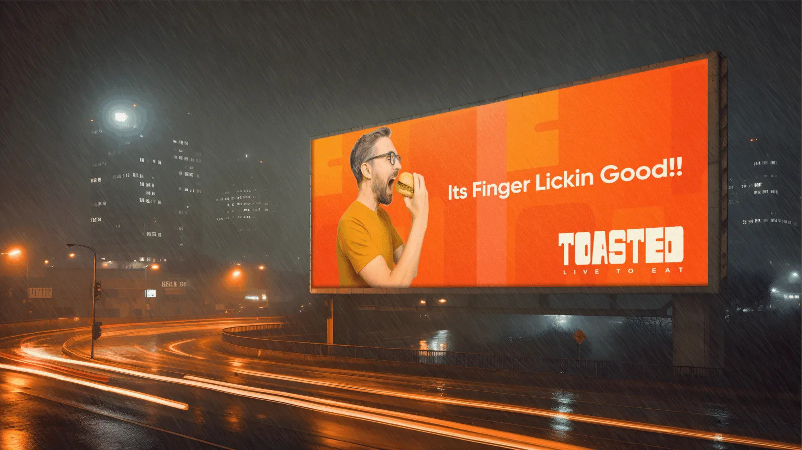
A brand you can read from a moving car.
Toasted sells burger and sandwich variety from a single storefront in Kochi. It needed a brand a hungry driver could read before missing the exit.
Sector
Food & Beverage
Work
Identity + Packaging
Credits
The speed test
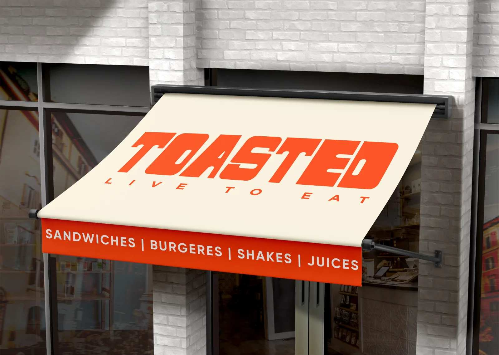
A highway billboard at night showing a man mid-bite, and a storefront awning reading "Toasted, Live to Eat" above the menu list: those are the two hardest tests any restaurant identity faces, because both have to work at a glance and from a distance, with no time for a customer to puzzle out what the place actually sells. Bold display type and a high-energy palette exist for exactly that problem. Everything about the mark is built for legibility first and personality second, which is the correct order for a brand competing with a moving car.
Packaging keeps the joke going
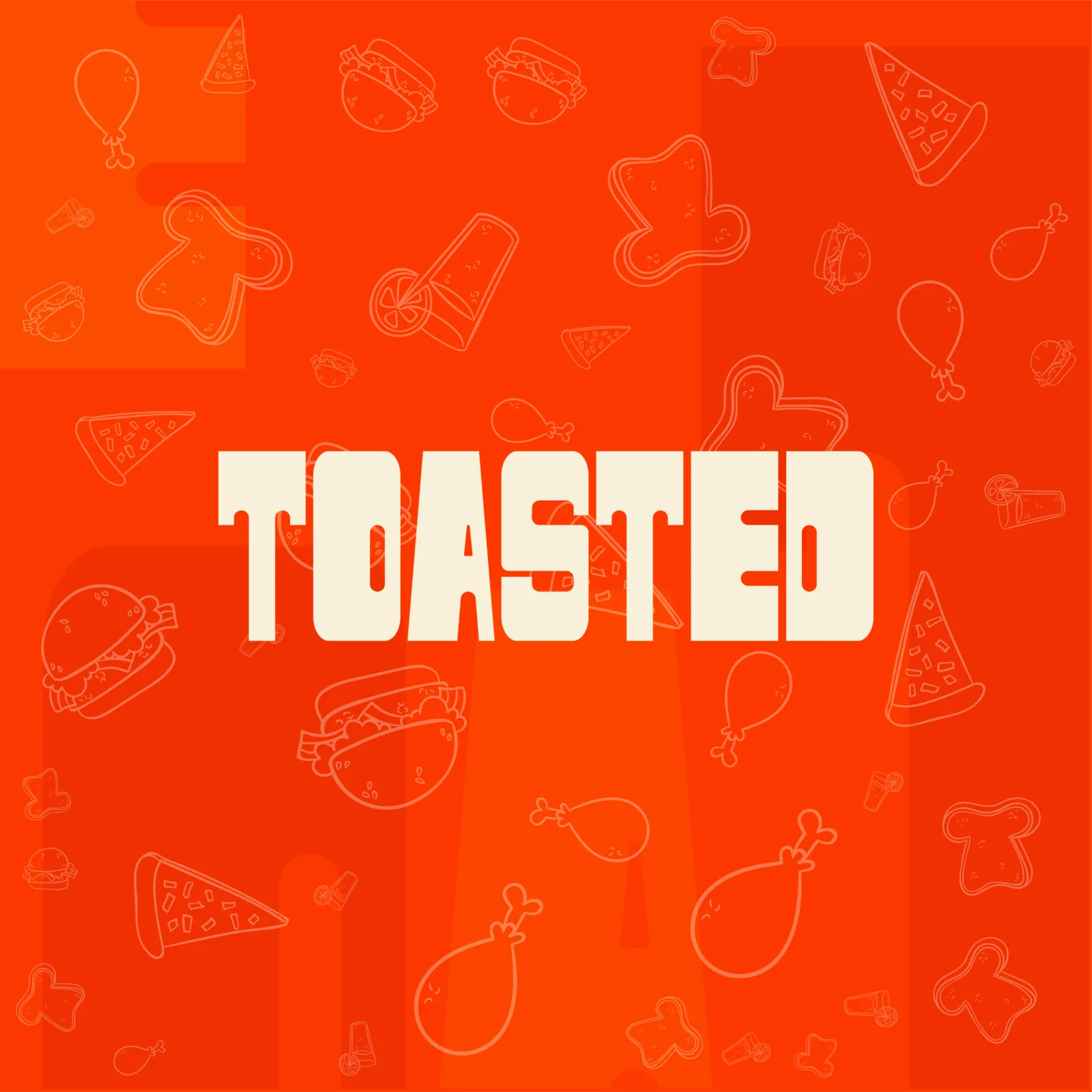
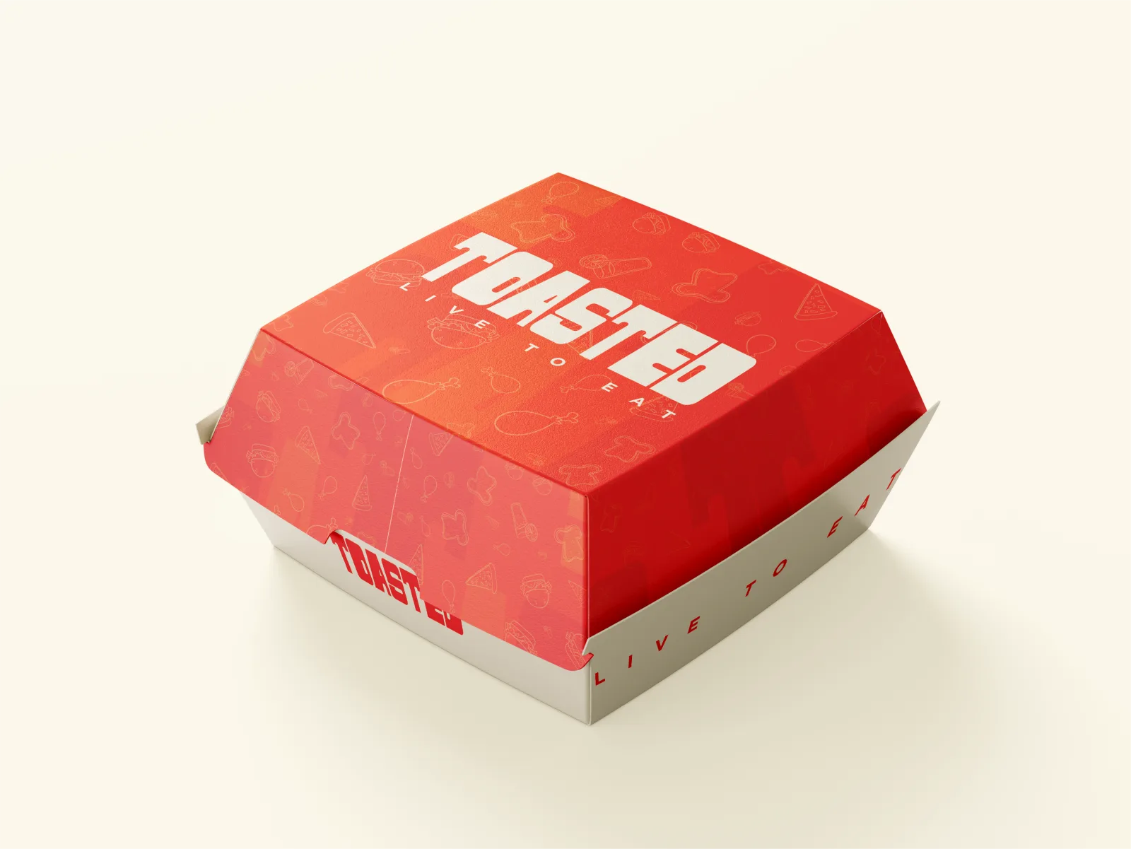
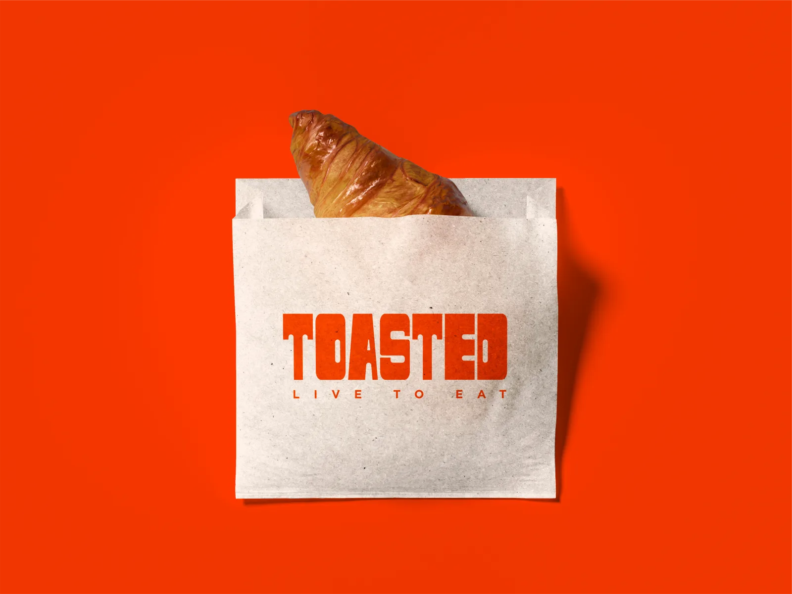
Once someone is close enough to read more than a headline, the identity gets to do more: an illustrated pattern of burgers and food icons sits behind the wordmark, the burger box carries the same tagline energy as the billboard, and a croissant sandwich goes out in a paper bag branded with no less care than the box. The bag is not an afterthought item run off without the rest of the system in mind; it is treated like a piece of collateral someone will actually look at on the walk back to the car. None of it is subtle, on purpose, because subtlety was never going to be the brand's job.