
BRAND IDENTITY
Bellpepper Media & Entertainment
A logo system, and every surface it had to survive.
Bellpepper Media & Entertainment sells advertising across print, digital, PR and cable television. The logo did not say so.
Sector
Advertising & Media
Work
Rebrand
Credits
What was already working
The agency had a real business. Print, digital, PR, cable TV: four channels, all of them running. What it did not have was a mark that looked like the work, or a set of rules that kept any two pieces of collateral looking related to each other. The identity had simply fallen behind the company it belonged to.
The mark itself
The rebuild started at the logo and moved outward. A new mark. A palette pulled tight enough to read as premium instead of loud. A typeface doing the work colour used to do. A grid that keeps any two pieces of collateral from looking like they came from different companies. None of it is decorative: the contrast is tight and the spacing is exact, because an agency that sells attention for a living cannot afford an identity that doesn't hold its own.
Where it had to hold
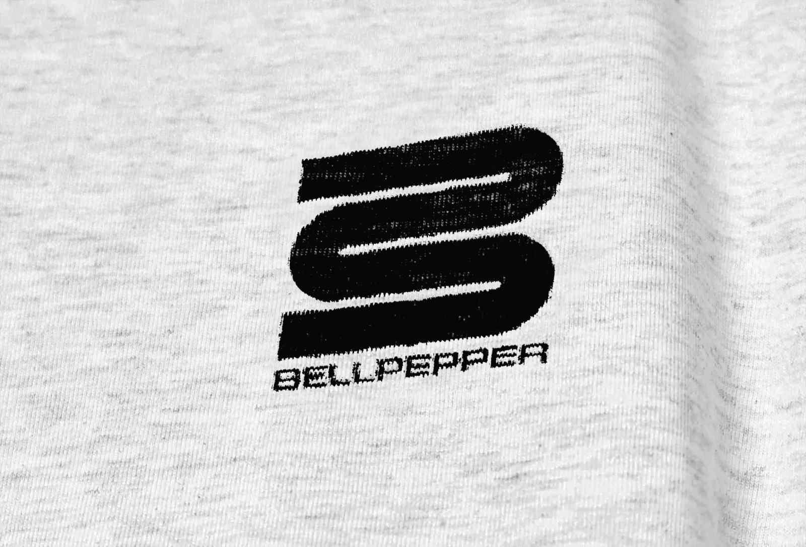
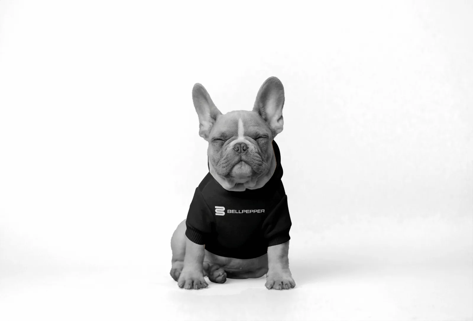
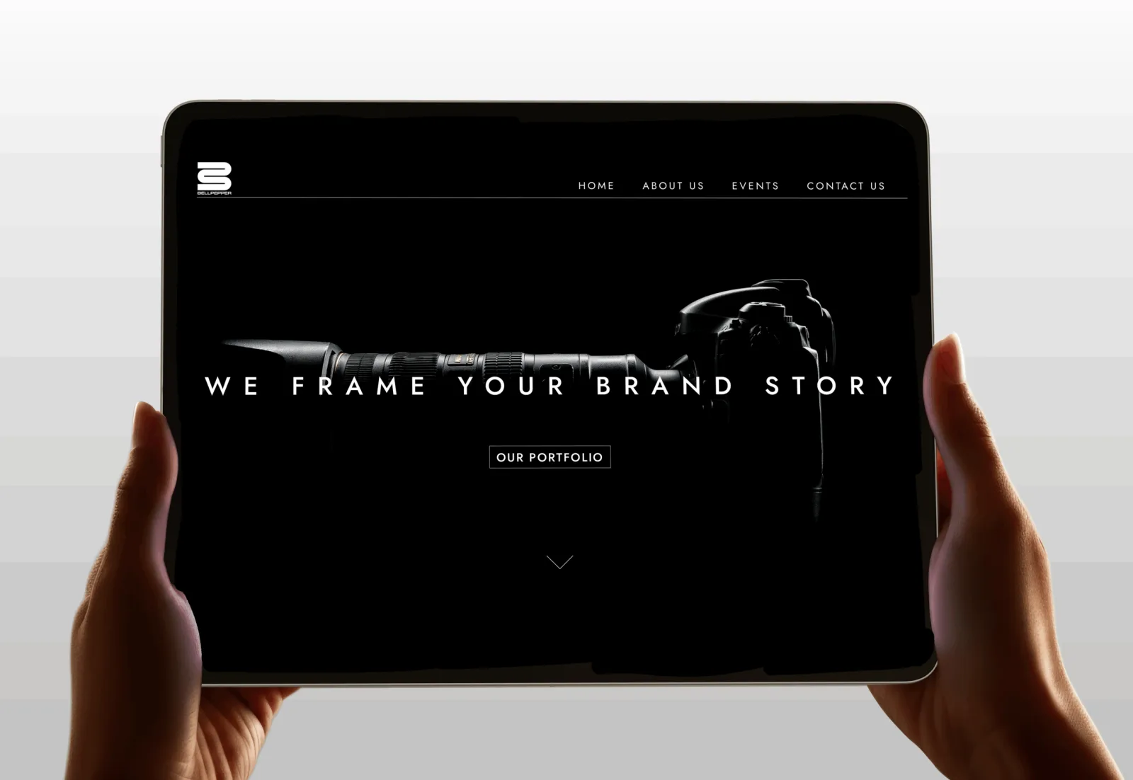
The system was drawn against the surfaces the agency actually uses. A mark sitting inside a camera aperture. A print on heather-grey cotton, and the same print on a dog. A brand film on a gallery screen. A homepage seen on a tablet. Four media, four different ways for a brand to fall apart, one system that has to arrive intact on all of them.