
BRAND + WEBSITE
Nadan Drip
One identity, from a t-shirt print to a product page.
Nadan Drip sells streetwear built on regional roots. The identity had to read as authentic and current at once, on a t-shirt, a sticker and a product page.
Sector
Fashion & Streetwear
Work
Identity + E-Commerce
Credits
Two audiences, one closet
Streetwear customers can smell an identity that is trying too hard to be either heritage or hype, so Nadan Drip could not lean fully into either. The mark needed to carry regional character without turning into folklore, and read as current without turning into a generic drop-culture logo. The wordmark and the graphic system sit in that gap: expressive enough to feel handmade, disciplined enough to survive being printed small on a sticker or large on a storefront awning.
One system, every surface
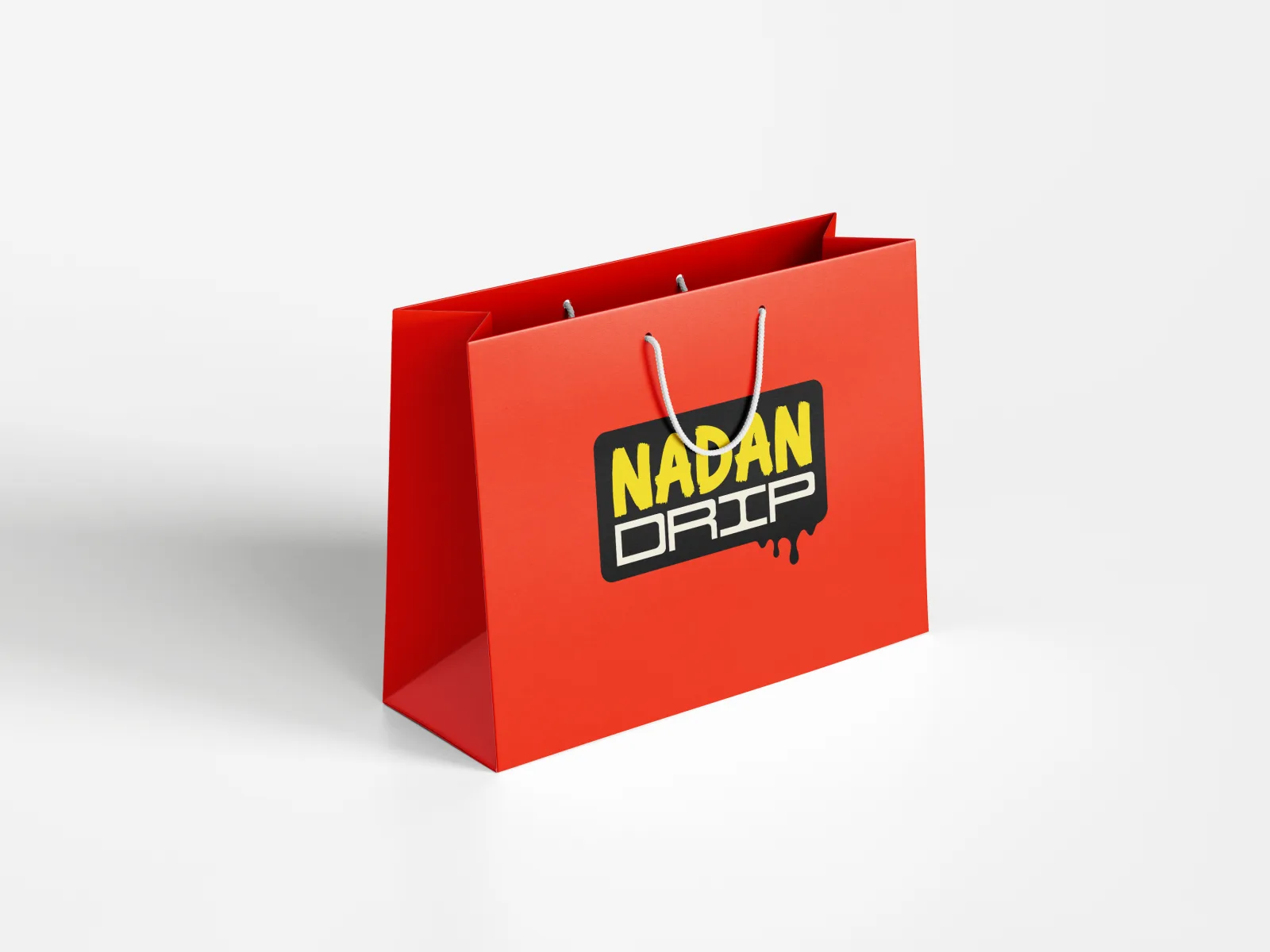
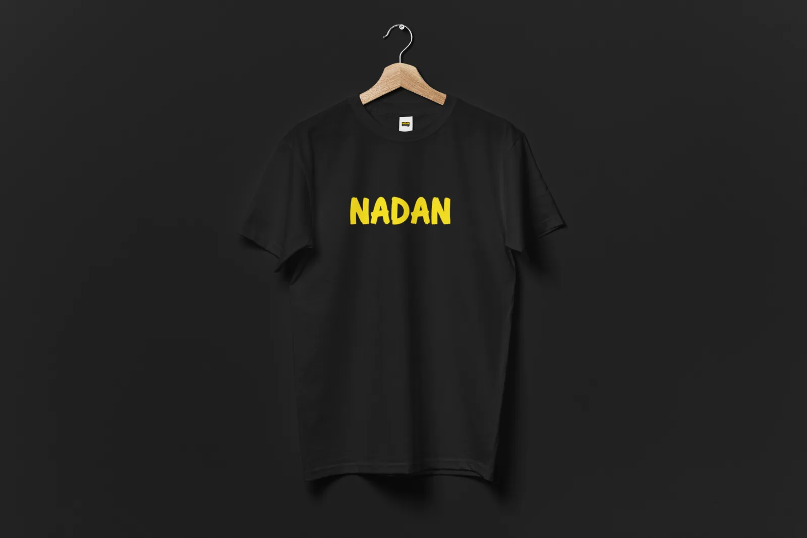
The identity runs on a high-contrast palette and a typographic voice built to move: from the wordmark lockup on a red textured ground, to a sticker peeling off its own backing, to a bag with rope handles, to the yellow print sitting flat on black cotton. None of these are separate treatments of the brand. They are the same handful of decisions, resized and recoloured for whatever the surface demands, which is the only way a small label keeps looking like one thing while it grows.
The store behind the storefront
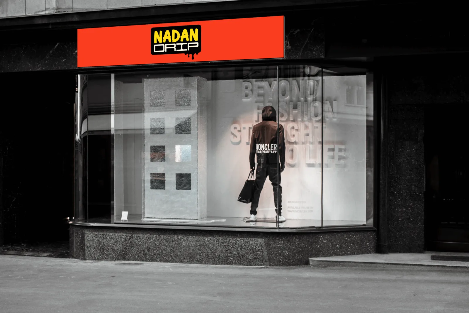
The storefront signage and the app icon on a phone home screen are the same brand doing two different jobs: one pulling someone in off the street, the other keeping the label a single tap away once they have already bought in. Neither works without the other. Building both from one identity was the point of the engagement, not an add-on to it.